Image Containers are in WAR

Web publishing pros struggle with image selection, publishing and rendering on modern websites.
There are several project hours wasted in image re-work and design. Moreover, explaining this to non-technical Clients is not easy.
Taking this on a war footing, we came up with a WAR convention. This is a simple solution to communicating and documenting image dimensions. This will be helpful to the web-publishing professionals across functions for a simplified convention of image dimensions.
The analogy is in Photography where the "Exposure Triangle" determines the "quality" of the photograph. Similarly, image containers can be specified by 2 parameters:
- W - Minimum Width of the image container
- AR - Aspect Ratio - calculated as image Width/Height
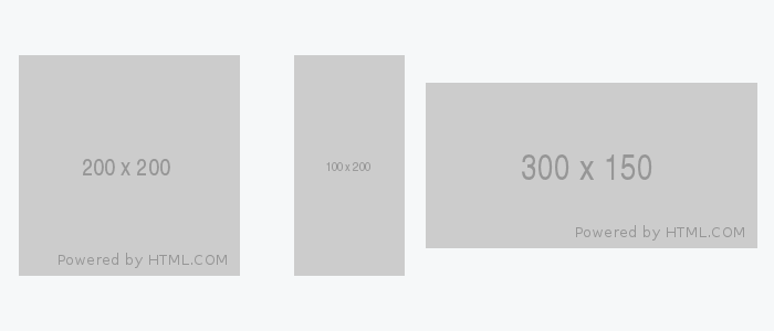
Referring to the diagram below:
- A WAR of 200 and 1 is a "square" type image
- A WAR of 100 and 0.5 is a "long rectangle" type image
- A WAR of 300 and 2 is a "wide rectangle" type image

By communicating these 2 parameters accurately makes image rendering on pages much simpler to understand. The benefits are as follows:
- High quality rendering of images on web-pages
- Better choice of images
- Efficient graphics work
- Better web-design in listing-detail page dependencies
High quality rendering of images on web-pages
If an image container's dimensions are "bigger" than the image's original dimensions, then the rendering is usually "stretched".
So the thumb rule for high quality rendering of image:
image container's dimensions <= image's original dimensions
OR
image's original dimensions => image container's dimensions
Better choice of images
We see many agencies pouring over hundreds of images to find a good creative fit for web content.
But once that is done, and they push it to the web page - they realise that it does not give the best results.
So if point 1 above is also kept in mind while selecting an image for a container, precious time and effort can be saved for the web publisher in choosing the perfect image.
Efficient graphics work
Often times, when point 2 becomes rigid and there is only that "one" image that fits the creative content - and point 1 also is a MUST, then graphics work will have to be done on the image.
Having a good handle on the WAR here can help in resolving the issue seamlessly.
Better design thinking in listing-detail page dependencies
Modern web publications have the common listing-detail page dependencies for images i.e.
The image in the detail page is in "large" dimensions, and the same image has to be rendered as a "smaller thumbnail" in the listing page.
A good handle of the WAR can help the "web-designer" to create consistent Aspect Ratios both on the detail page and the listing page.
When designers do not keep this in mind, back-end developers are seen creating "extra image fields" just for this....eeps!
Also, it is very helpful that front-end developers have a good handle of the CSS properties like "object-fit" that provides scaling, resizing and cropping images in CSS code.
That being said, I believe that "all" web-professionals should have basic "graphics" skills like scaling, cropping and resizing images. It makes web-graphic work very smooth anywhere in the web-publishing workflow.
Hope this WAR can provide peace!
