Gifographics - Storify Your Data

The Graphics Interchange Format (GIF) is a bitmap image format that was developed by US-based software writer Steve Wilhite while working at the Bulletin board service (BBS) provider CompuServe on June 15, 1987 and has since come into widespread usage on the World Wide Web due to its wide support and portability.
GIF has roots reaching to June 15th, 1987 - half a decade before the World Wide Web itself. It offered support for a paltry 256 colors. Its animation capabilities were easily rivaled by a flipbook. It was markedly inferior to virtually every file format that had followed it. On top of that, there were the threats of litigation from parent companies and patent-holders which had been looming over GIF users for five long years before the fiery call to action. By Burn All GIFs Day, the GIF was wobbling on the precipice of destruction. Those who knew enough to care deeply about file formats and the future of the web were marching on the gates, armed with PNGs of torches and pitchforks.
And yet, somehow, here we are. Seventeen years later, the GIF not only isn't dead. It rules the web!
If data is the new oil, then digital visualizations are the cool new gears.
There are a plethora of frameworks emerging by the day that enable us to represent data creatively. D3js, High Charts and Google Charts are some of the more popular web based libraries.
But once the visualization is in place, can it be extended to a story?
Using GIFs, we can use visuals to tell a story of data comparison, contrast, break-up and classification.
Add a series of such GIFs in an infographic, and we get a creative called a gifographic.
In the infographic, the first visualization is GIF based on 2 images:
The first is money given to Indian states/ districts for spending on rural sanitation. Each large box represents one State. In the second image, the smaller boxes represent a District. (Source: The India Water Portal)
In the second visualization, the data refers to Comparison of water use in Traditional and Drip Irrigation. This was available in a spreadsheet. We have visualized it as a GIF. In the GIF, there 2 images of area charts. The first is an area chart comparison of Yield employing 2 methods, the second is an area chart comparison of Water Usage employing the 2 methods. (Source: The Open Government Data Platform (OGD) of India)
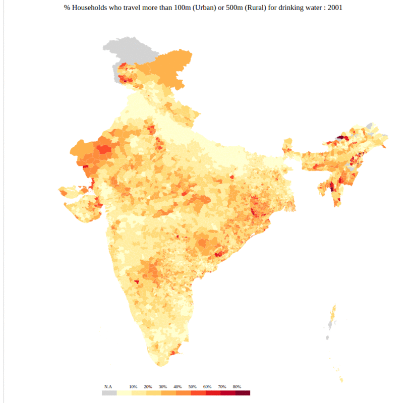
In the third visualization, we have taken 2 maps to map the shifts in access to drinking water in India. We have created a GIF with 2 images. The orange map shows that the percentage of households in rural areas who have to travel a distance to find drinking water. The blue map below shows the other part of the story. It maps the proportion of households who had access to drinking water at home, both in rural and urban areas. Compare the map below with the orange one and note the regional differences in the data. (Source: Data Stories)
GIFs and Gifographics are a great method to visualize data as image frames. It is a creative new way to inference a data story.